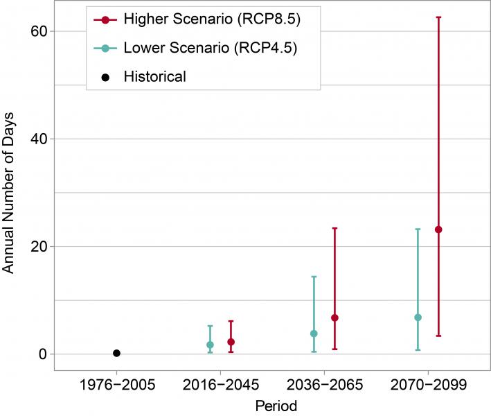
The graph shows the annual number of days above 100°F in Chicago for the historical period of 1976–2005 (black dot) and projected throughout the 21st century under lower (teal) and higher (red) scenarios. Increases at the higher end of these ranges would pose major heat-related health problems for people in Chicago. Click the image for more information.
As shown by the black dot, the average number of days per year above 100°F for 1976–2005 was essentially zero. By the end of the century (2070–2099), the projected number of these very hot days ranges from 1 to 23 per year under the lower scenario and 3 to 63 per year under the higher scenario. Both scenarios show an increasing number of days over 100°F with time, but increasing at a faster rate under the higher scenario. For the three future periods, the teal and red dots represent the model-weighted average for each scenario, while the vertical lines represent the range of values (5th to 95th percentile). Sources: NOAA NCEI and CICS-NC.

